PROJESAN
Posicionamento, Identidade Visual, Comunicação, Consultoria
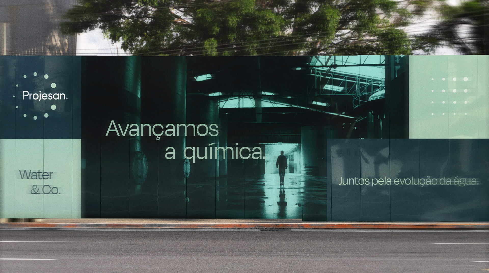
Juntos pela evolução da água.
Com mais de 30 anos de atuação na indústria química, a Projesan decidiu realizar um movimento estratégico para aumentar a lembrança da sua marca no universo de águas industriais e municipais. Ao percorrer uma longa e profunda jornada em parceria com os estrategistas de marca e designers da Molde, a expectativa de se destacar e assumir protagonismo no segmento tornou-se real, resultando no reposicionamento total de sua marca (rebranding).
A criação de um discurso emocional conectado com a estratégia do negócio foi a solução ideal para diferenciar a Projesan da concorrência. Em conjunto com o impulso empreendedor da diretoria, fortalecemos e transformamos a marca em um dos principais ativos estratégicos da empresa. Assim, a “Projesan Saneamento Ambiental” deu lugar à “Projesan Water & Co” — Juntos pela evolução da água.
EN
Together for the evolution of water.
With more than 30 years of experience in the chemical industry, Projesan decided to make a strategic move to increase its brand awareness in the field of industrial and municipal water. After a long and in-depth journey in partnership with Molde's brand strategy and design team, the expectation of standing out and taking a leading role in the segment became real, resulting in the total repositioning of its brand (rebranding).
With more than 30 years of experience in the chemical industry, Projesan decided to make a strategic move to increase its brand awareness in the field of industrial and municipal water. After a long and in-depth journey in partnership with Molde's brand strategy and design team, the expectation of standing out and taking a leading role in the segment became real, resulting in the total repositioning of its brand (rebranding).
The creation of an emotional storytelling connected to the business strategy was the ideal solution to differentiate Projesan from the competition. With the board of directors' entrepreneurial drive, we strengthened and transformed the brand into one of the company's main strategic assets. Thus, “Projesan Saneamento Ambiental” gave place to “Projesan Water & Co” — Together for the evolution of water.

Diferenciação que vem de dentro.
Em 2019, quando o projeto de rebranding foi iniciado, a Projesan era mais uma entre várias indústrias que utilizavam termos técnicos e comuns ao segmento para se referir à própria empresa e para comunicar o potencial dos seus produtos. Na época, os números da empresa incluíam 96 colaboradores, 918 municípios atendidos e 92 mil pessoas beneficiadas com água tratada.
A partir das análises e descobertas obtidas por meio de imersões criativas, vivências, workshops e entrevistas com os stakeholders, identificamos que o principal atributo de diferenciação da Projesan estava nas pessoas — e isso precisava ficar claro.
O cuidado da Projesan com a evolução de cada pessoa era percebido pelos clientes e parceiros que, durante as entrevistas em profundidade, demonstraram carinho ao mencionar os nomes dos colaboradores com os quais mantinham contato, mesmo dizendo conhecer pouco ou quase nada sobre a empresa.
EN
Differentiation that comes from within.
In 2019, when the rebranding project began, Projesan was one of several industries that used technical terms common to the segment to refer to the company itself and to communicate the potential of its products. At the time, the firm's numbers included 96 employees, 918 cities served, and 92 thousand people benefiting from treated water.
From the analyses and discoveries obtained through creative immersions, in-company experiences, workshops, and interviews with stakeholders, we identified that Projesan's main differentiation attribute was in its people — and that needed to be made clear.
Projesan's care for the evolution of each person was perceived by clients and partners who, during the in-depth interviews, demonstrated affection while mentioning the names of the employees with whom they had contact, even though they claimed to know little or nothing about the company.

Quando um ganha,
todo mundo ganha.
todo mundo ganha.
O principal insight do novo posicionamento da Projesan veio do presidente que, num tom leve e enfático, falou em uma das imersões: “Quando um ganha, todo mundo ganha”. Após validar essa constatação por meio de análises interna e externa, ajudamos a construir o novo discurso da marca.
Com isso, foi possível afirmar que “quanto mais a Projesan se dedica para facilitar o acesso à água de qualidade, maior é o espaço que ela cria para a evolução acontecer de maneira conjunta”. Afinal, “evoluir juntos faz parte da sua natureza e, na Projesan, a evolução começa pela água”.
Ao invés de enfatizar seus produtos e serviços de qualidade como mensagem principal, a Projesan assume uma forma original de dizer que é especialista em tratamento de água ao comunicar seu objetivo de “avançar a química de quem trata água todos os dias”.
Dessa forma, a marca demonstra saber que “ao melhorar a qualidade da água, melhoramos também a qualidade de vida da nossa rede”, incluindo colaboradores, clientes e todos aqueles que consomem a água que a Projesan ajuda a tratar.
EN
When someone wins, everyone wins.
The new positioning's main insight came from the president who, in a light and enthusiastic tone, said during a creative immersion: “When someone wins, everyone wins”. After validating this statement through internal and external analyses, we helped build the brand's new storytelling.
Based on that, it was possible to affirm that “the more Projesan dedicates itself to facilitating access to quality water, the greater the space it creates for evolution to happen collectively”. After all, “evolving together is part of its nature and, at Projesan, the evolution starts with water”.
Instead of emphasizing the quality of its products and services as the central brand message, Projesan adopts an original way of saying that it is a specialist in water treatment by communicating its goal of “advancing the chemistry of those who treat water every day”.
Therefore, the brand demonstrates that “by improving the quality of water, we also improve our network's quality of life”, including employees, customers, and everyone who uses the water that Projesan helps to treat.
Uma arquitetura
de marca estratégica.
de marca estratégica.
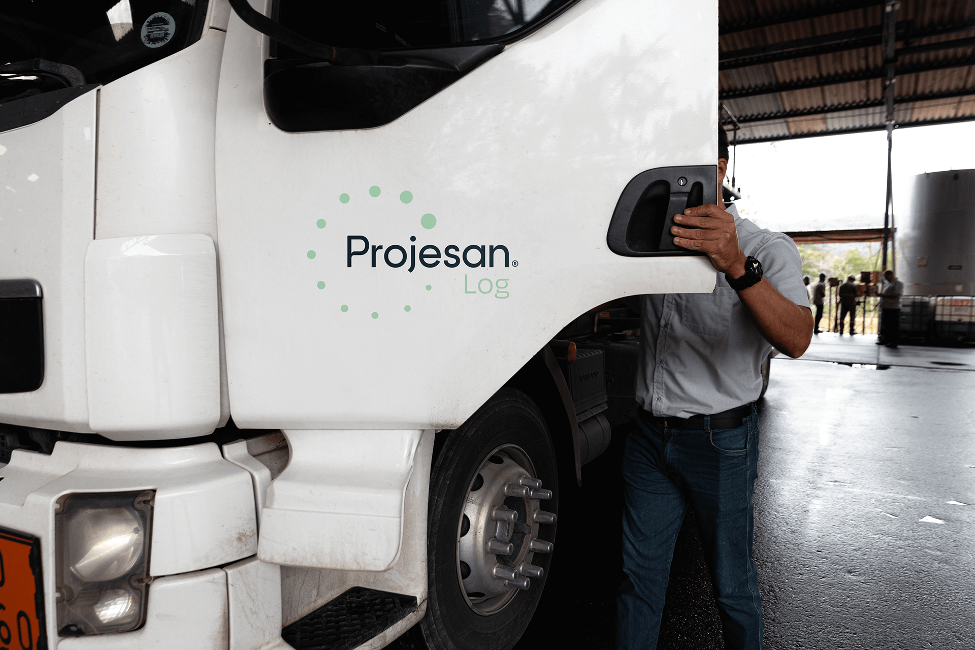
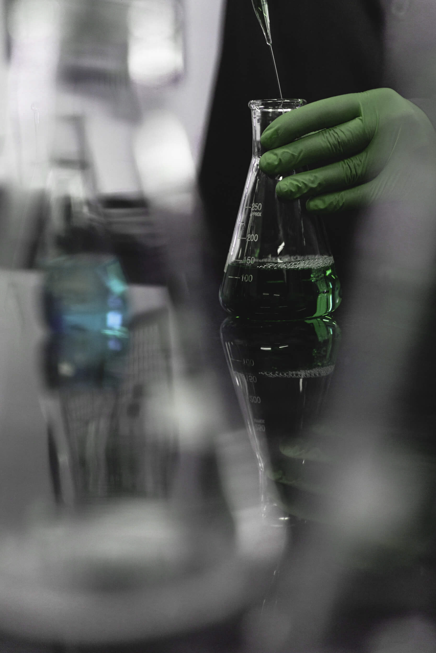
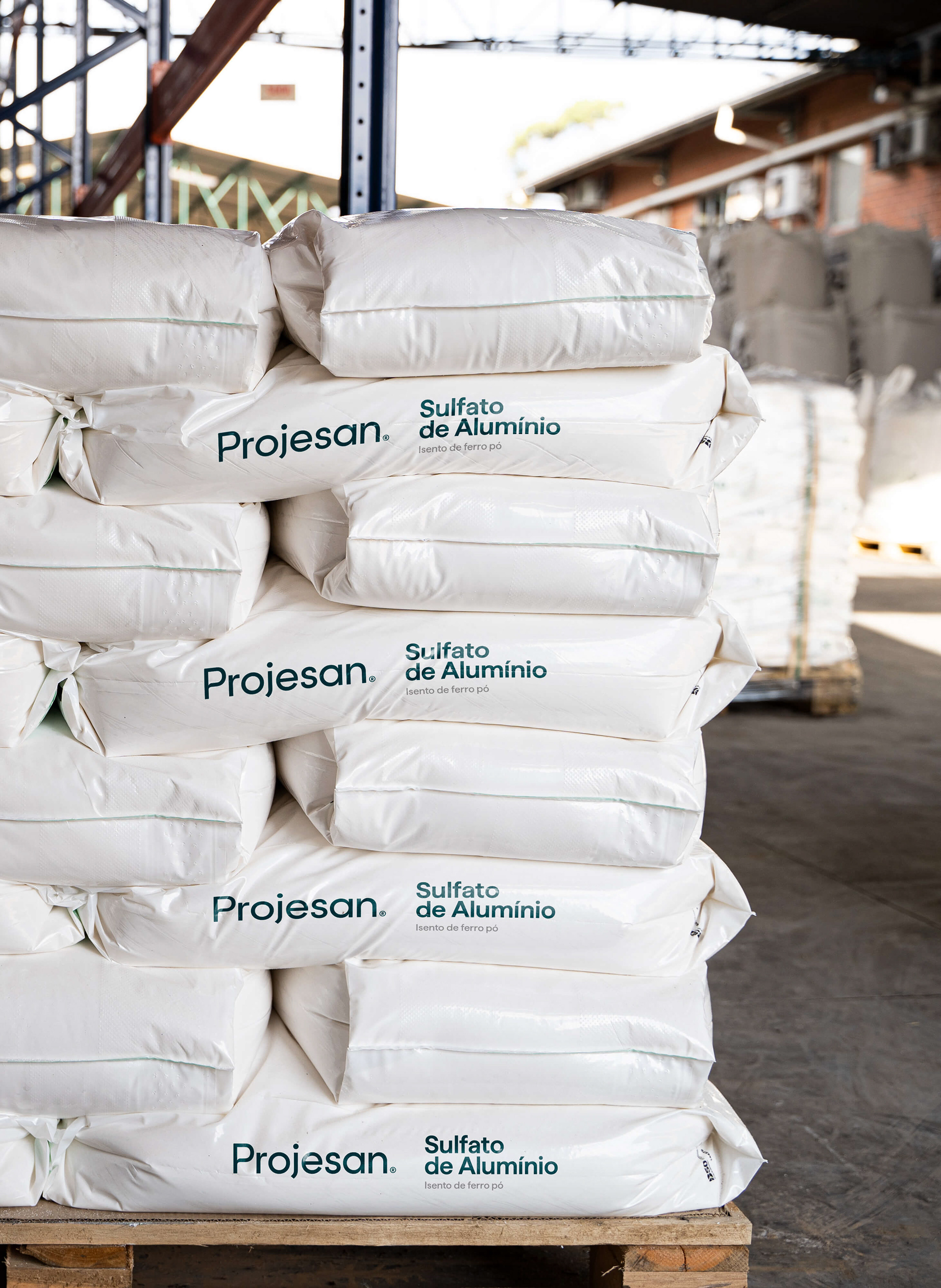
A consultoria de marca realizada pela Molde também identificou que a Projesan se destaca no segmento por possuir: (1) um laboratório especializado, que garante a qualidade de todos os produtos que entram e saem da empresa; e (2) uma logística integrada, com uma frota própria de caminhões certificados e uma equipe capacitada tanto para transportar quanto para descarregar produtos químicos.
Chamar a atenção para estes serviços foi uma decisão estratégica para aumentar a percepção de valor da marca e aproximá-la do seu perfil de cliente ideal. Assim, a Projesan Water & Co ganhou duas submarcas: Projesan Lab e Projesan Log, que até então era chamada de Rodosan.
EN
A strategic brand architecture.
Molde's brand consultancy also identified that Projesan stands out in the segment because it has: (1) a specialized laboratory, which ensures the quality of every product that enters and leaves the company; and (2) an integrated logistics, with its own fleet of certified trucks and a team capable of not only transporting but also unloading chemical products.
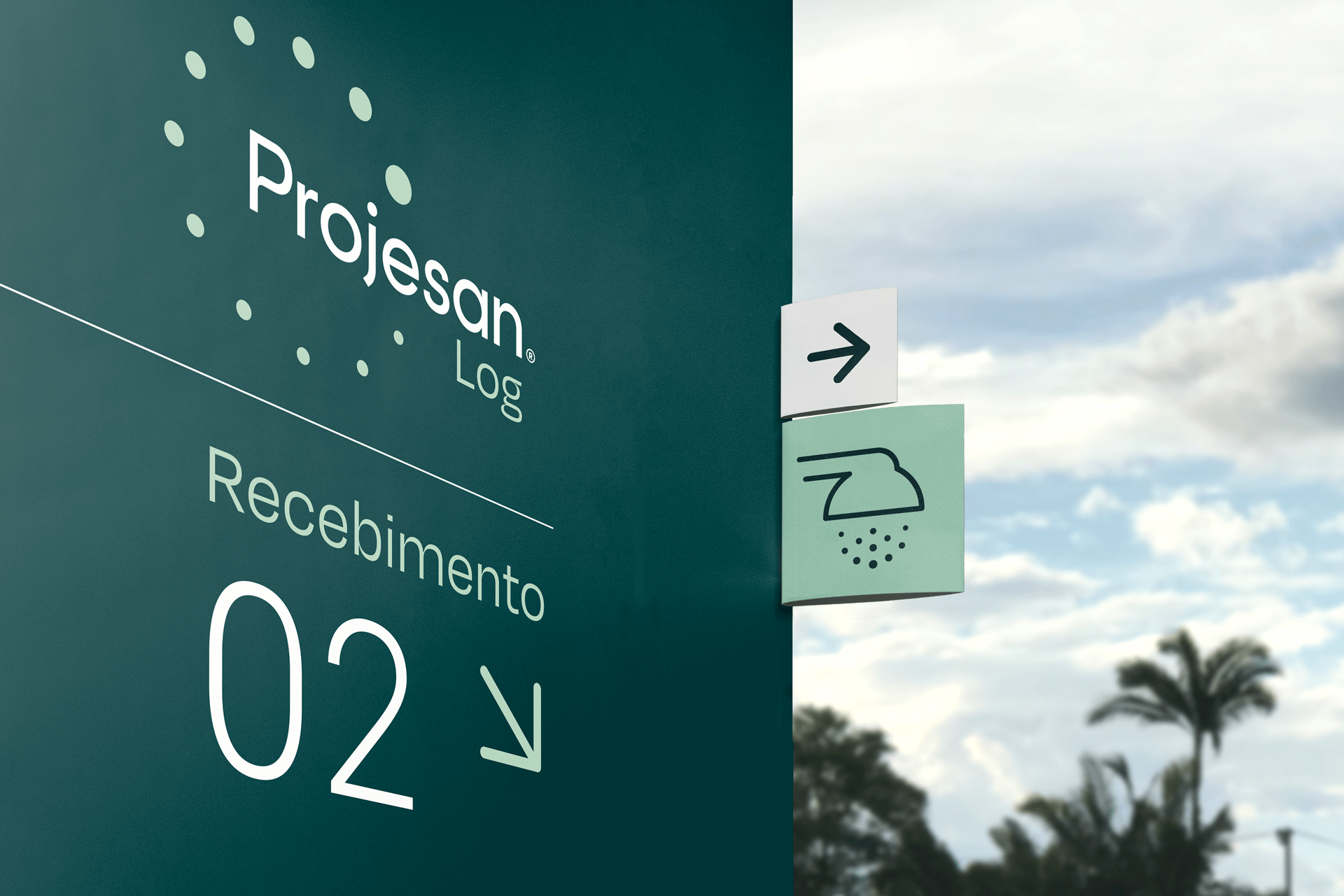
Drawing attention to these services was a strategic decision to improve the brand's perceived value and bring it closer to its ideal customer profile. Thus, Projesan Water & Co acquired two sub-brands: Projesan Lab and Projesan Log, which had been called Rodosan until then.

Surge uma nova
identidade visual.
identidade visual.
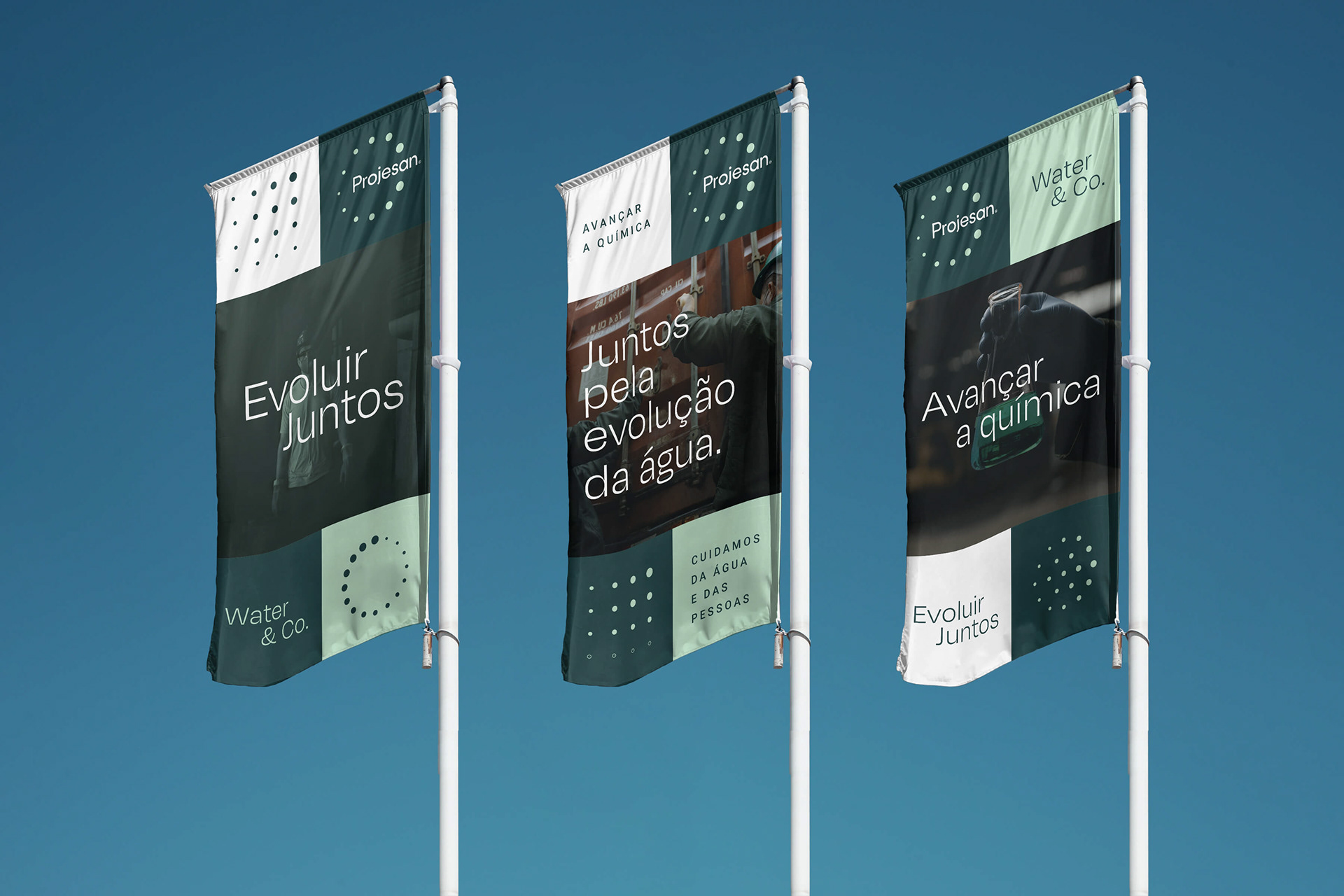
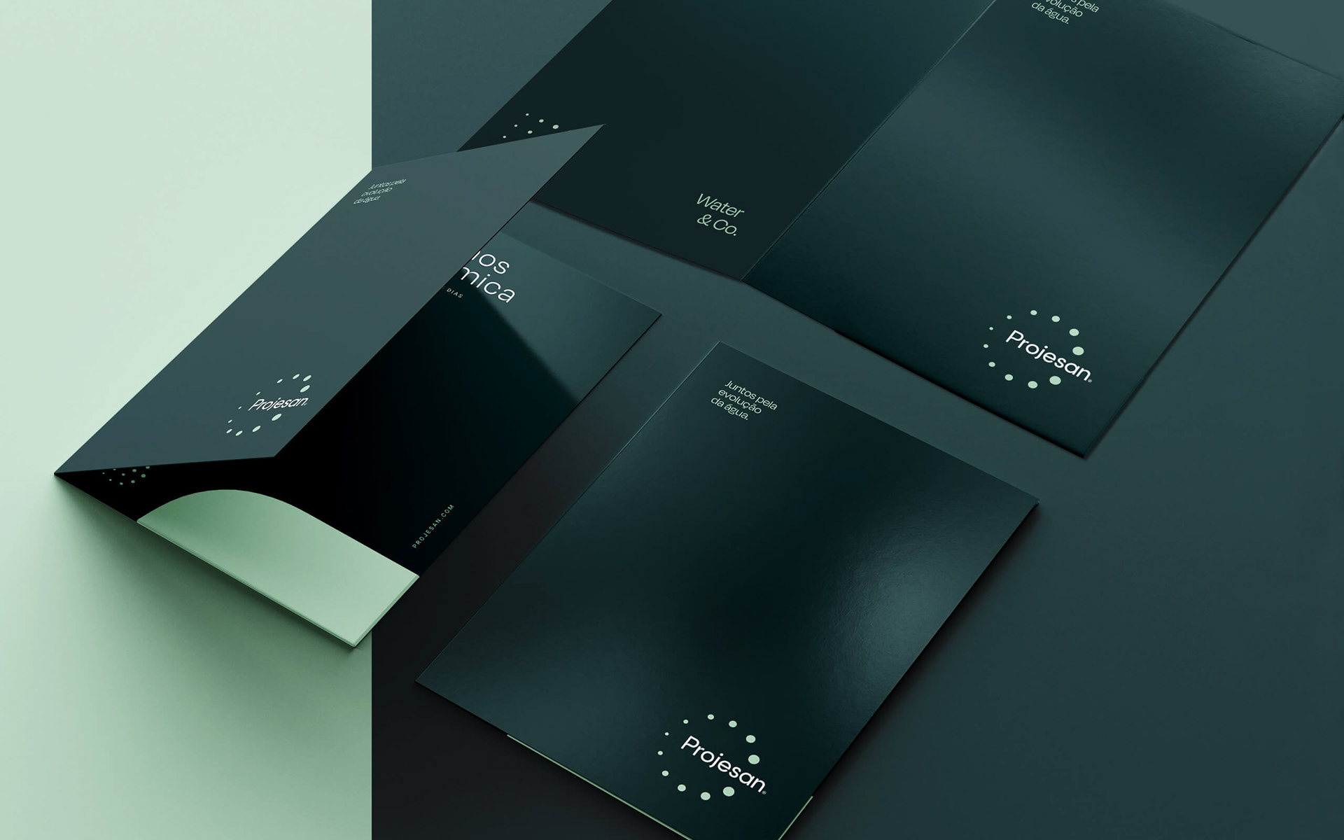
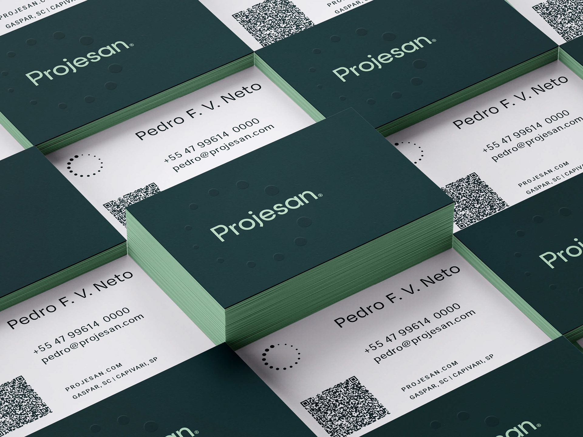
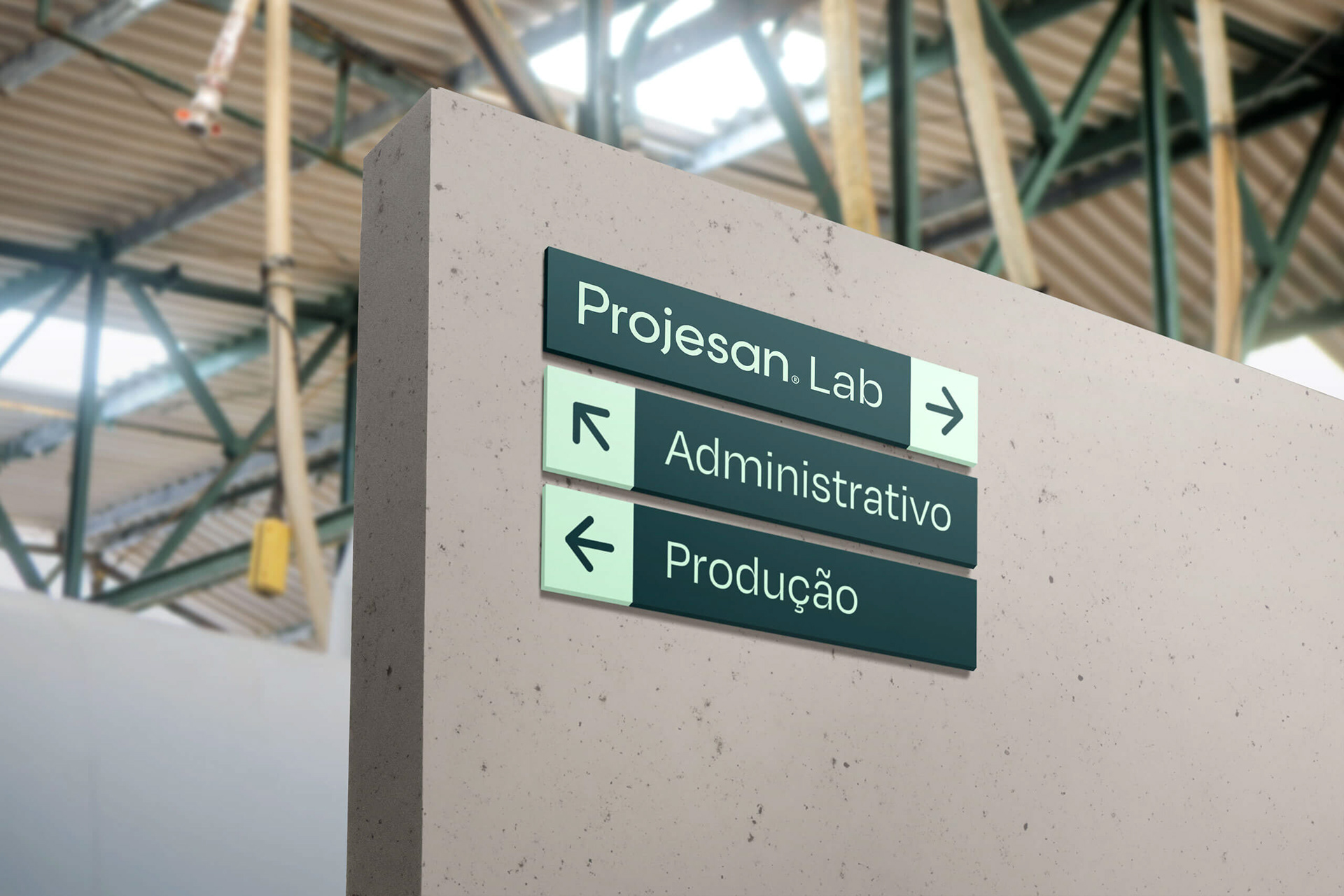
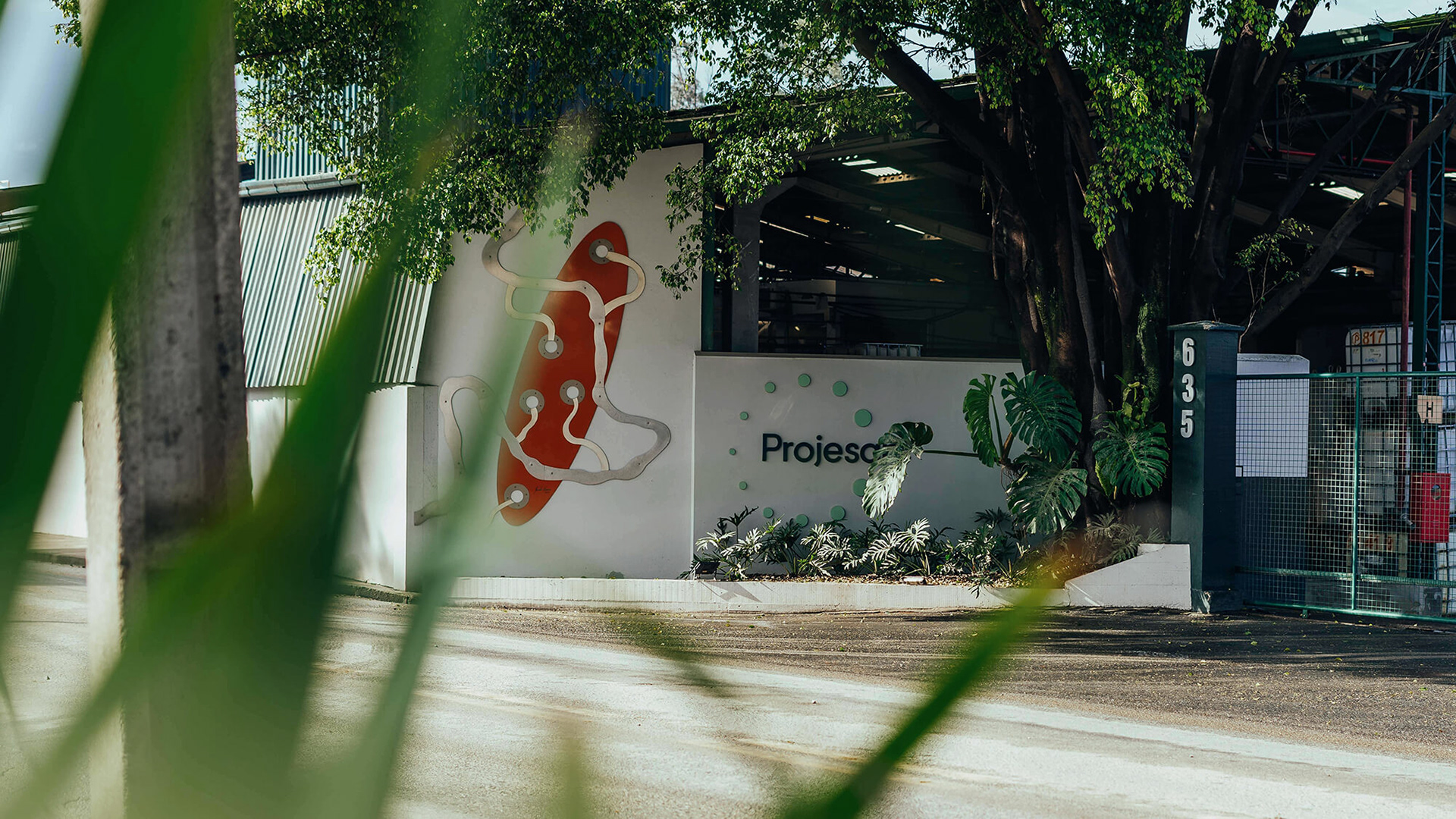
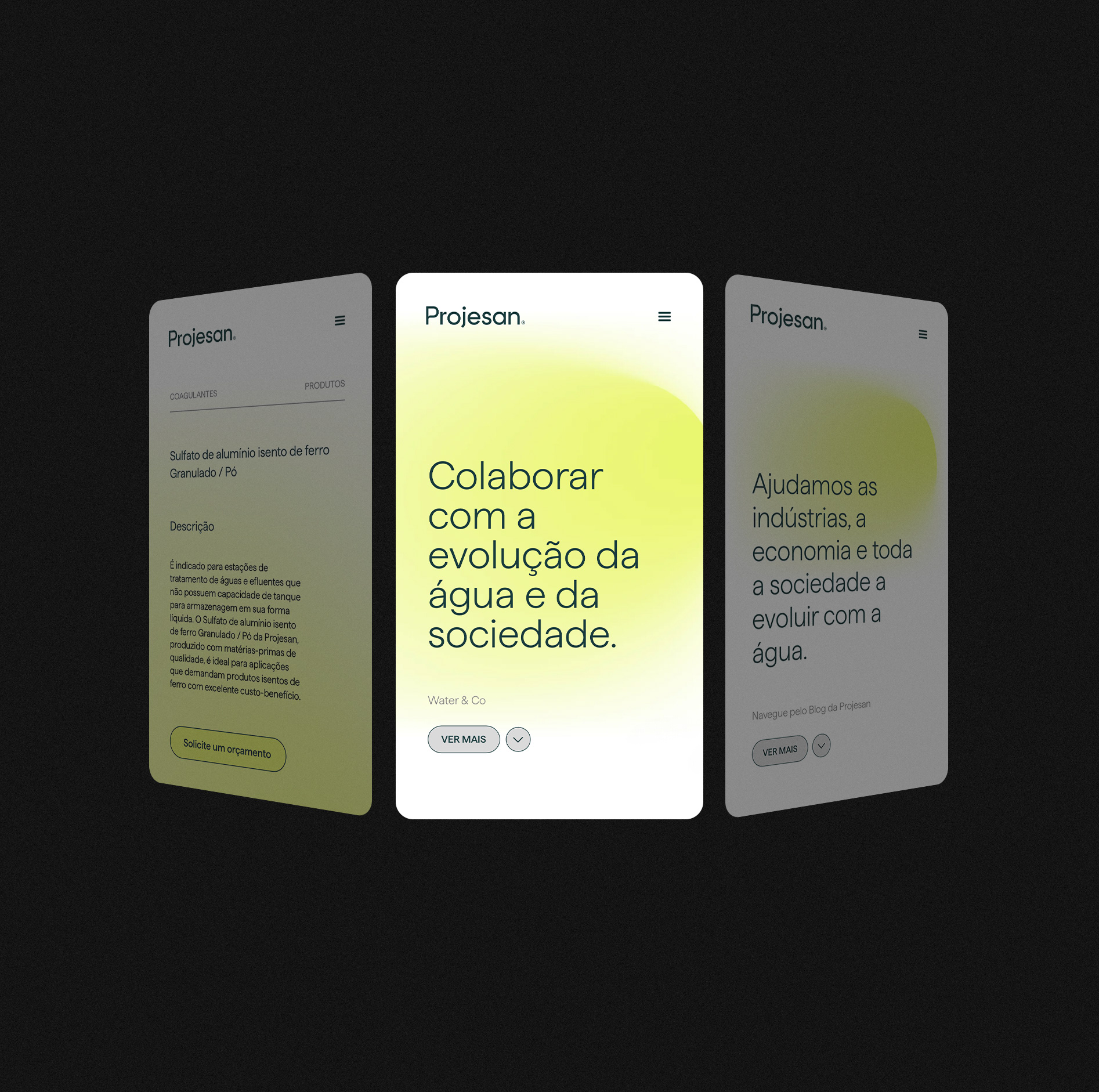
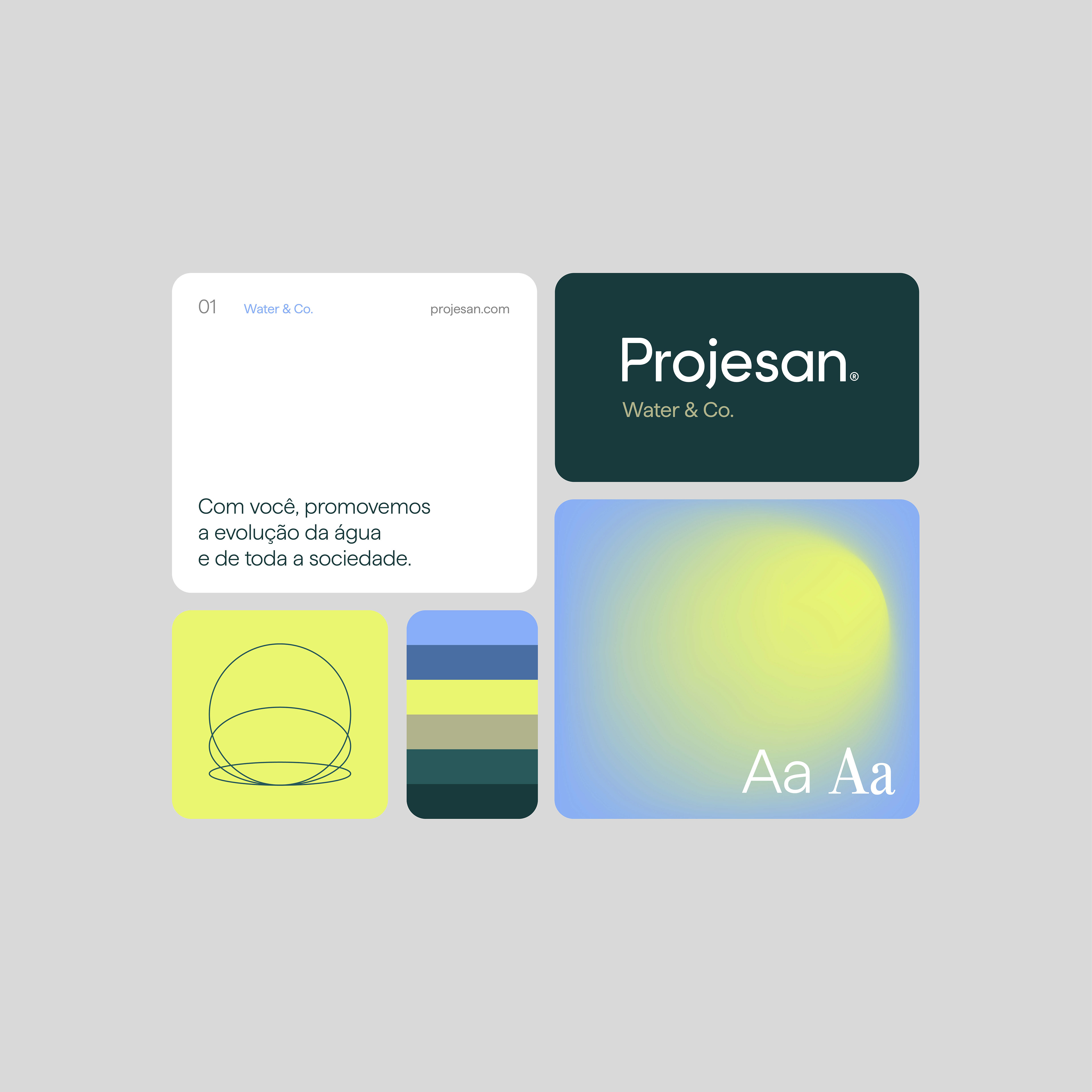
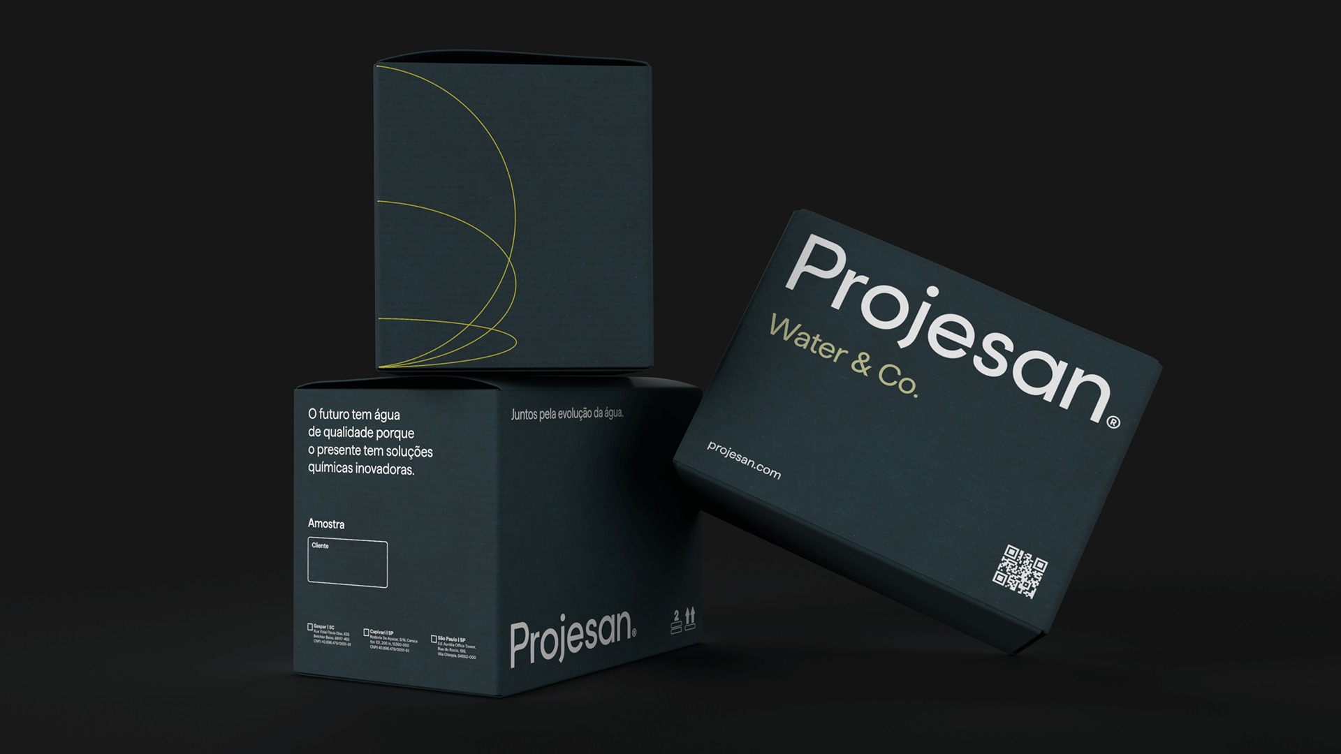
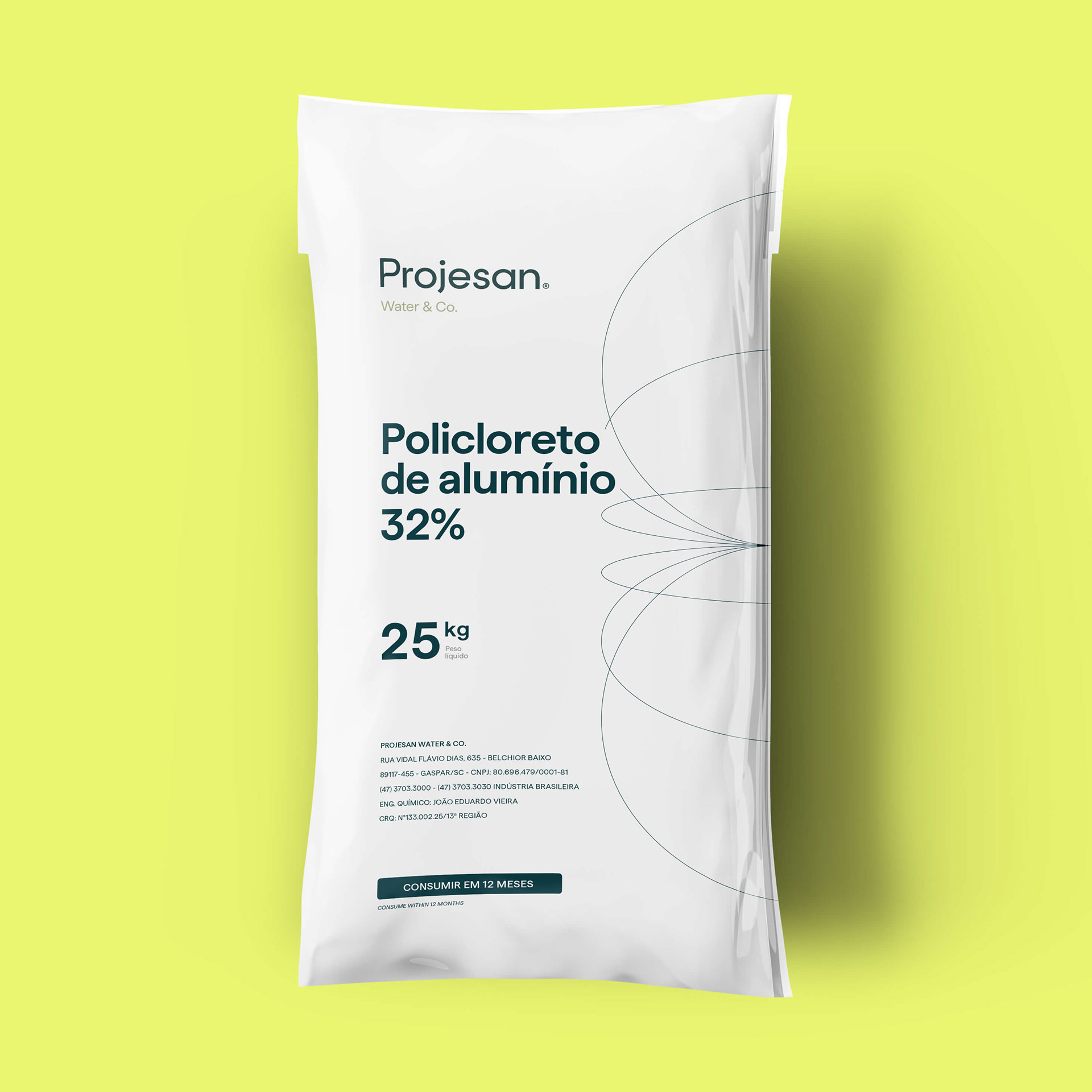
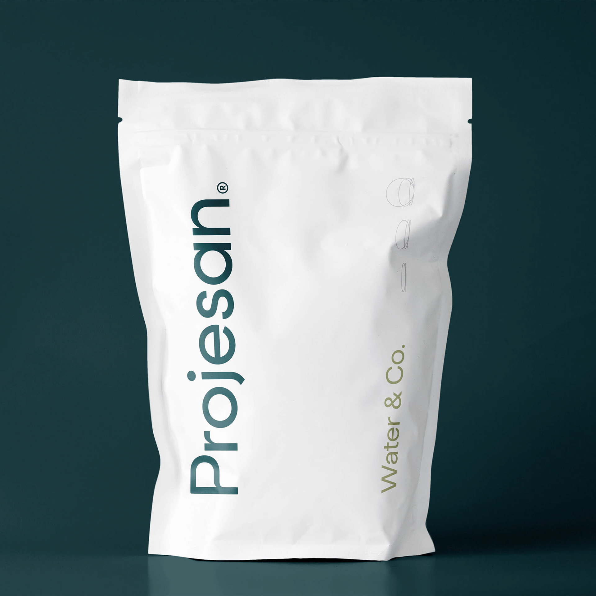
Com uma personalidade proativa, transparente, generosa, madura e visionária, a Projesan evoluiu seu logo — que tinha um anel de carbono como símbolo principal — para um sistema de identidade visual mais original e compatível com o novo posicionamento.
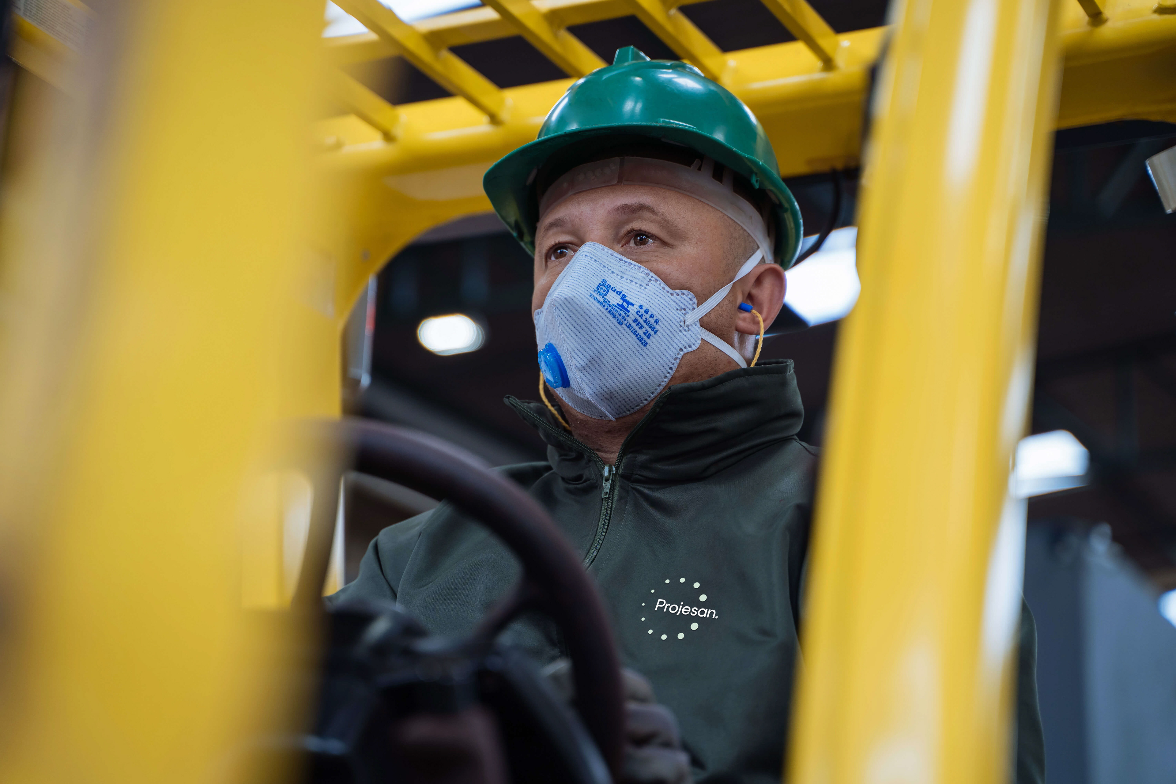
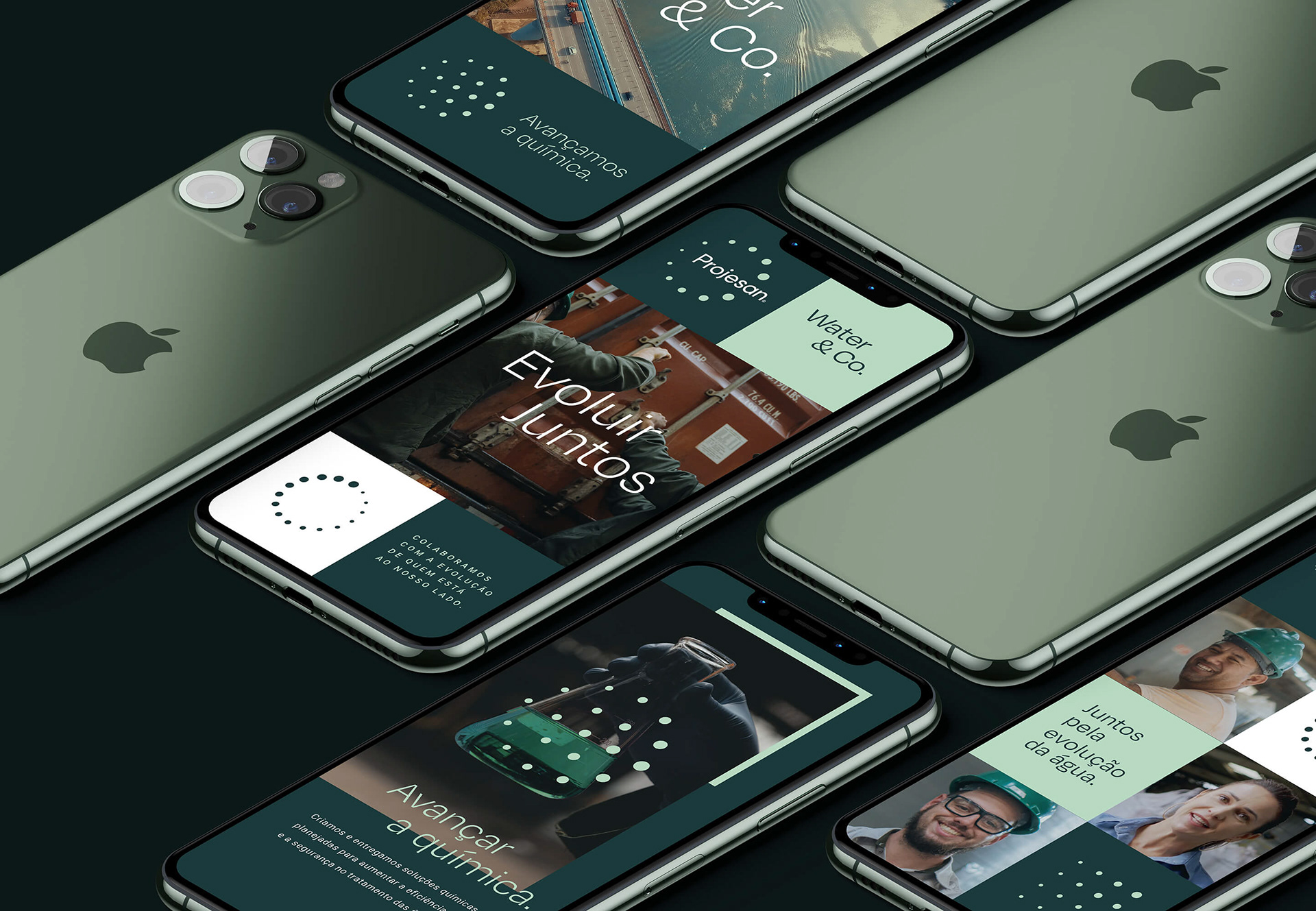
Representando o processo de tratamento de água, os tons de verde claro e branco remetem à purificação, enquanto o verde escuro honra a memória já construída pela Projesan ao longo dos anos. As tipografias, selecionadas de forma estratégica para trazer versatilidade à comunicação, vão do funcional ao expressivo. Direcionamos ainda o padrão fotográfico da marca, incluindo imagens que representam sua essência, como a colaboração e o desenvolvimento contínuo.
Para as submarcas Projesan Log e Projesan Lab, sugerimos incorporar os símbolos de apoio da mesma forma que na marca principal, conferindo dinamismo às aplicações em diversos pontos de contato. Dessa forma, construímos materiais de comunicação compostos por grids com formas quadradas, que transmitem modernidade, grandeza e organização.
EN
A new visual identity emerges.
With a proactive, transparent, generous, mature, and visionary personality, Projesan has evolved its logo — which had a carbon ring as the main symbol — into a more original visual identity system that is compatible with its new positioning.
Representing the water treatment process, the light green and white tones refer to purification, while the dark green honors the memory established by Projesan over the years. The typography, strategically selected to bring versatility to the communication, range from the functional to the expressive. We also directed the brand's photographic pattern, including images that represent its essence, as collaboration and continuous improvement.
For the Projesan Log and Projesan Lab sub-brands, we suggested incorporating the supporting symbols in the same way as for the main brand, giving dynamism to the applications at various touchpoints. Therefore, we built communication materials made up of grids with square shapes that transmit modernity, greatness, and organization.


Evoluir faz parte — e fez.
O rebranding proporcionou grandes conquistas à Projesan, a ponto de colocá-la num outro patamar em apenas três anos. Evoluir é algo tão intrínseco à marca que, em 2024, foi necessário um ajuste de rota.
Se antes o objetivo da marca era evidenciar um discurso emocional que valoriza as pessoas por trás da operação, seu novo desafio era ainda mais complexo: manter-se estável no lugar que alcançou, para então seguir evoluindo.
Para tal, trabalhamos na atualização da linguagem verbal e visual da Projesan, posicionando a marca como autoridade no segmento e direcionando sua comunicação para grandes cidades e empresas, além de instituições renomadas do setor.
EN
Evolving is part of it — and it was.
The rebranding has given Projesan great achievements, to the point of taking it to the next level in just three years. Evolving is something so intrinsic to the brand that, in 2024, it was necessary to adjust course.
If the brand's goal had previously been to highlight an emotional discourse that values the people behind the operation, its new challenge was even more complex: to remain stable in the place it had reached, so that it could continue to evolve.
To this end, we worked on updating Projesan's verbal and visual languages, positioning the brand as an authority in the segment and directing its communication towards large cities and companies, as well as renowned institutions in the sector.

Mesma essência.
Um novo jeito de se apresentar.
Um novo jeito de se apresentar.
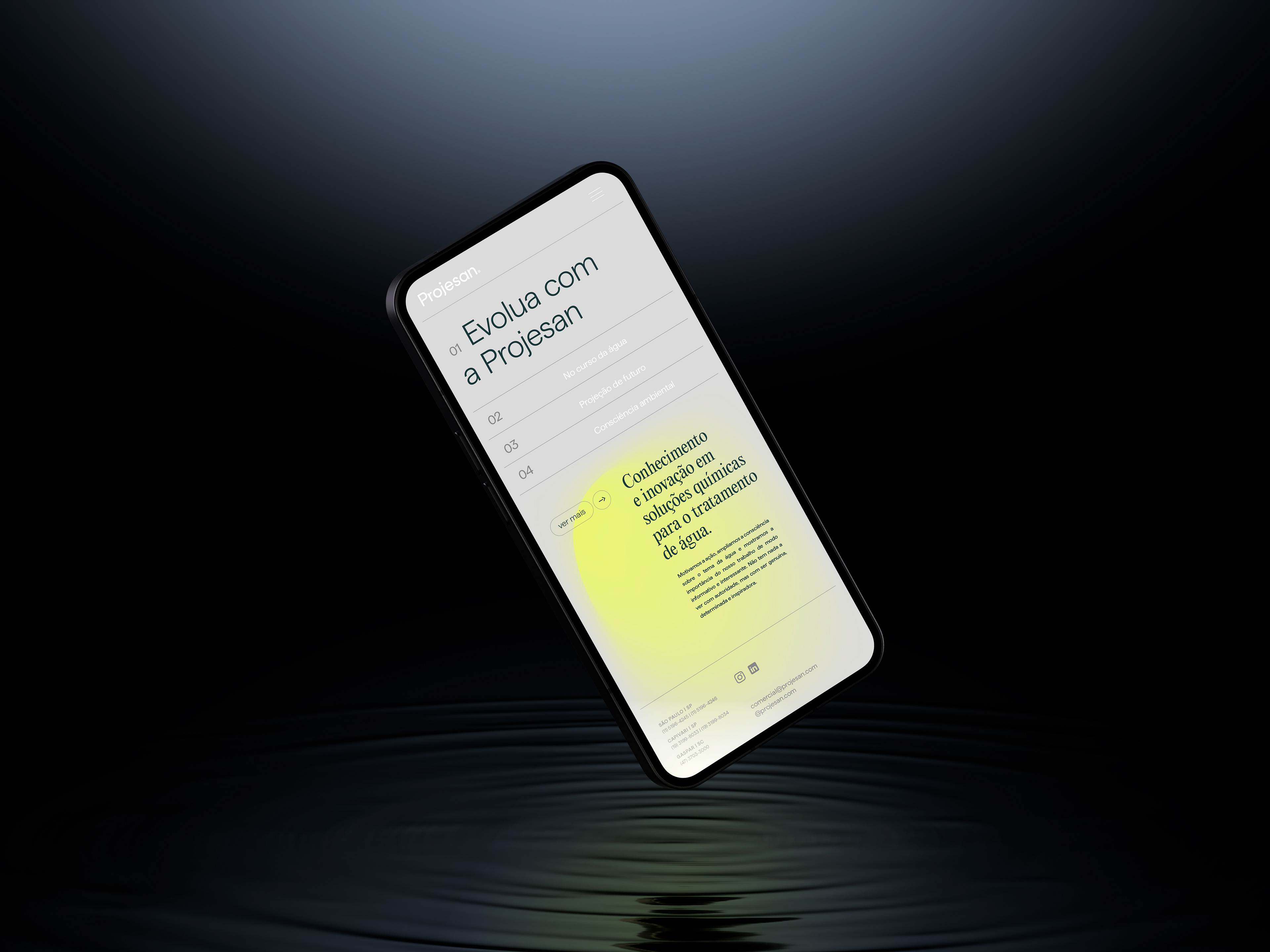
A Projesan agora se destaca pela objetividade, liderança e visão. Sua essência não muda, mas a forma de falar sim. Assumindo uma postura mais realizadora que sonhadora, o desejo de agradar deu lugar à missão de mobilizar, transformar e evoluir. Afinal, a Projesan “abre torneiras, mercados e possibilidades”.
Em parceria com a CriaTexto, a identidade verbal da marca foi ajustada para se tornar mais direta e profissional, mostrando resultados, apresentando números, dizendo o que precisa ser dito e evitando floreios. Com isso, a Projesan deixou de falar do futuro com um tom imaginativo e passou a motivar a ação de forma genuína, comprometendo-se a fazer — no presente — o que é preciso para transformar a realidade. De forma determinada e inspiradora, a marca amplia a consciência das pessoas sobre o tema da água ao demonstrar a importância do seu trabalho.
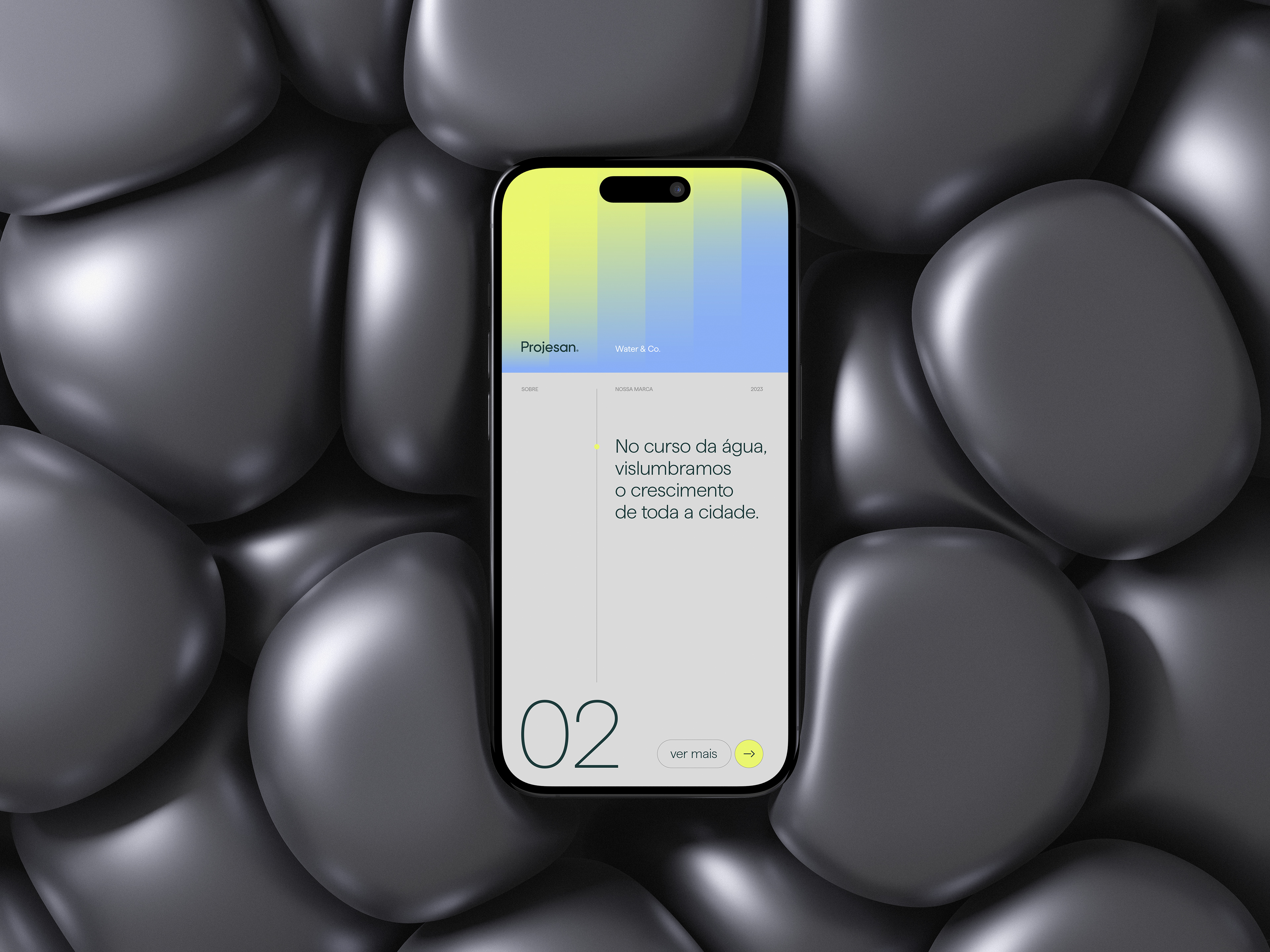
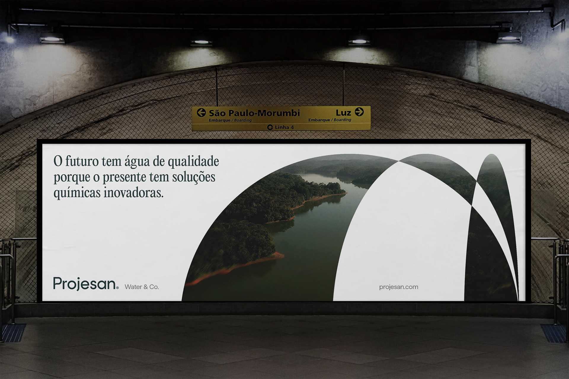
Para refletir estas mudanças e convidar as pessoas a “evoluir com a Projesan”, a sua identidade visual também foi atualizada. Os tons de verde escuro e claro representam não apenas o processo de tratamento da água, mas também a preocupação em preservar a natureza. Já que “cuidar da química é cuidar do todo”, o branco também desperta as sensações de leveza, limpeza e tranquilidade.
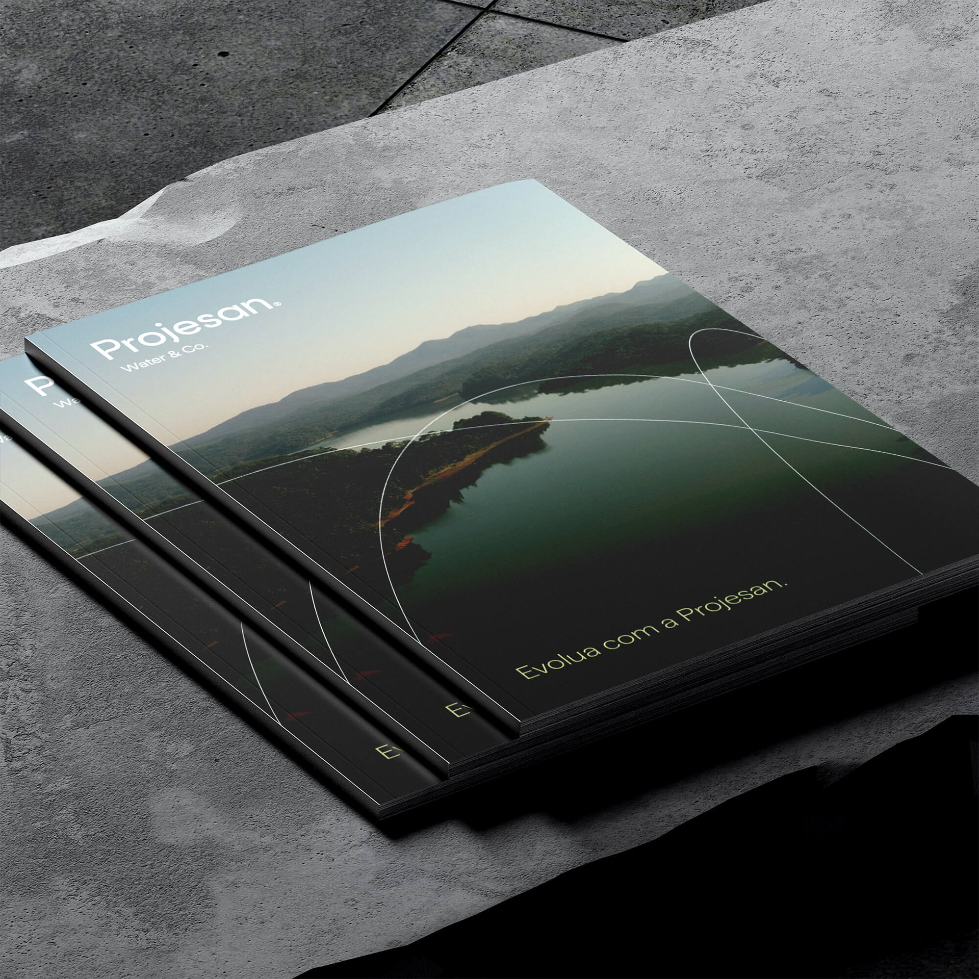
Baseando-se na promessa de “promover a evolução da água e de toda a sociedade”, o novo direcionamento fotográfico desenvolvido para a Projesan transmite grandeza, esperança, colaboração e desenvolvimento. Assim, sugerimos que a comunicação visual da marca inclua pessoas “juntas pela evolução da água”.
EN
The same essence.
A new way to present itself.
A new way to present itself.
Projesan now stands out for its objectivity, leadership, and vision. The essence hasn't changed, but the way it speaks has. Taking a more achiever than dreamer posture, the desire to please gave place to the mission of mobilizing, transforming, and evolving. After all, “Projesan opens taps, markets, and possibilities”.
In partnership with CriaTexto, the brand's verbal identity was adjusted to become more direct and professional, showing results, presenting numbers, saying what needs to be said, and avoiding flourishes. With this, Projesan stopped talking about the future with an imaginative tone and started genuinely motivating action, committing itself to doing — in the present — what's necessary to transform reality. In a determined and inspiring way, the brand raises people's consciousness on the water subject by demonstrating the importance of its worK.
To reflect these changes and invite people to “evolve with Projesan”, its visual identity was also updated. The dark and light green tones represent not only the water treatment process, but also the concern to preserve nature. Since “taking care of chemistry is taking care of the whole”, the white also evokes feelings of lightness, cleanliness, and tranquility.
Based on the promise of “promoting the evolution of water and of society as a whole”, the new photographic direction developed for Projesan expresses greatness, hope, collaboration, and development. We therefore suggested that the brand's visual communication includes people “together for the evolution of water”

Direção Estratégica
Robson Stédile
Robson Stédile
Direção Criativa
Alexandre Kumm
Alexandre Kumm
Designers
Alexandre Kumm, Gabrielle Vasselai, Marlon Bruno da Silva
Alexandre Kumm, Gabrielle Vasselai, Marlon Bruno da Silva
Direção de Conteúdo
Robson Stédile
Robson Stédile
Redação
Renata Monteiro, Robson Stédile
Renata Monteiro, Robson Stédile
Animações
João Pedro Roncalio
João Pedro Roncalio
Time criativo do projeto
Alexandre Kumm, Carla Mereles, Gabrielle Vasselai, Guilherme N. Hack, João Pedro Roncalio, Marlon Bruno da Silva, Milo Moskorz, Robson Stédile.
Alexandre Kumm, Carla Mereles, Gabrielle Vasselai, Guilherme N. Hack, João Pedro Roncalio, Marlon Bruno da Silva, Milo Moskorz, Robson Stédile.
Fotografias
Guilherme Lucca, Jeann FM
Guilherme Lucca, Jeann FM
Time Projesan
Cristiana Menestrina, Cristiane Lehmann, Eduardo D. de Oliveira, Elis Vieira Makowski, João Vieira, Miriam Regina Vieira, Pedro Francisco Vieira Neto.
Cristiana Menestrina, Cristiane Lehmann, Eduardo D. de Oliveira, Elis Vieira Makowski, João Vieira, Miriam Regina Vieira, Pedro Francisco Vieira Neto.